The Great Kebab Menu Debate
Every designer has paused over a kebab menu at some point. Not the restaurant kind—the UI kind. Those three little dots that hide overflow actions when your navigation runs out of room. But one question haunts design systems and Slack channels alike:
Should those dots be horizontal
…or vertical⋮?
he conventional wisdom is simple. Vertical kebabs align with Material Design and Android patterns. Horizontal meatballs feel more at home on iOS and web. Pick your platform, follow the guidelines, move on.
But I think I’ve cracked the real answer:
It’s not about operating systems. It depends on your locale ;).
The Culinary Theory of UI
The icon is called a “kebab menu” for a reason—it looks like food on a skewer. So why aren’t we looking to the culinary world for guidance?
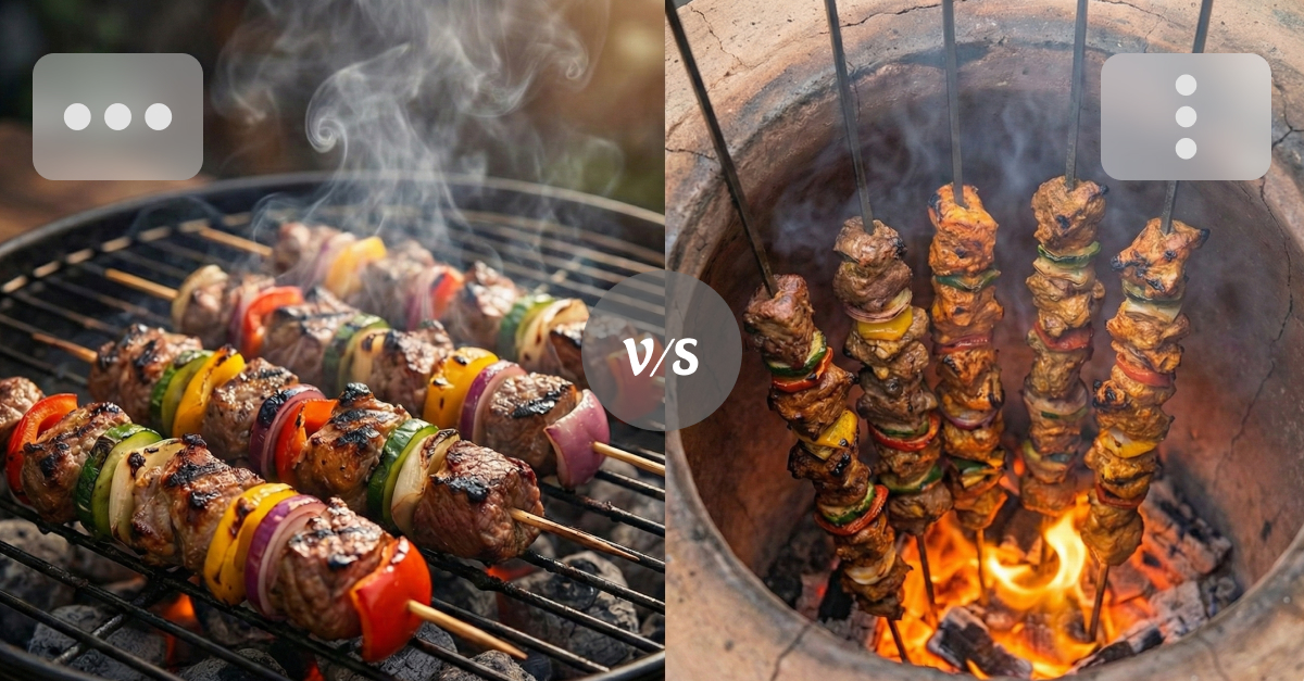
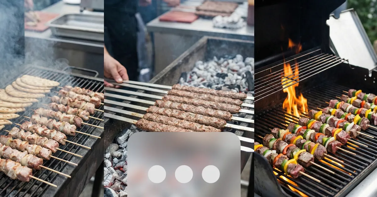
In some cultures, kebabs cook horizontally.
Mediterranean souvlaki laid flat on a charcoal grill. Persian koobideh turned side to side over hot coals. American backyard skewers kissed evenly by flame from below.
Exhibit A: The Horizontal Approach
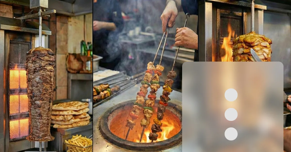
In other cultures, kebabs cook vertically.
Turkish doner and Arabic shawarma rotating on upright spits. Skewers lowered into the intense heat of an Indian tandoor.
Exhibit B: The Vertical Approach
Maybe the choice between horizontal and vertical ellipsis isn’t a design decision at all…
… It’s a culinary one
Culinary Localization
If we really care about user-centric design, we need to look past the screen and onto the dinner plate.
- Users in regions where kebabs cook horizontally? Use the horizontal ellipsis
…. It just feels natural. - Users familiar with vertical rotisseries or tandoors? Give them the vertical kebab
⋮. It’s only right.
We spend hours localizing copy, adjusting date formats, flipping layouts for RTL languages. Why stop there?
Let’s embrace culinary localization.
Next time you’re debating the dots with your PM, forget Material Design guidelines. Ask them how they take their shawarma instead.